

Another metric sending a U.S. recession warning, Part II
Daily Thoughts 2 Apr 2025

Last Friday, I wrote about the private-sector yield curve of the U.S. Then I noticed that we needed an update with longer time series, because the data does not cover a single period of stagflation (recession + rapid inflation). Here’s the “short” private-sector yield curve with the most recent data.
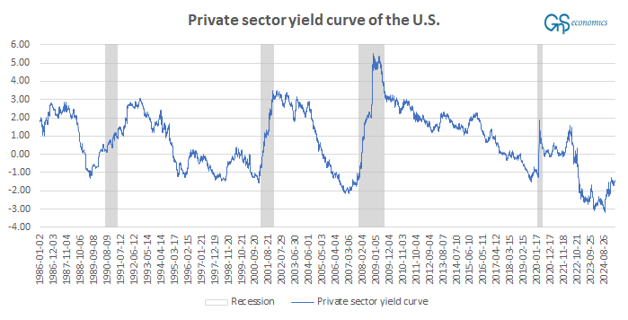
The next figure presents the private-sector yield curve, reaching 1955.
Keep reading with a 7-day free trial
Subscribe to Tuomas Malinen on Geopolitics and the Economy to keep reading this post and get 7 days of free access to the full post archives.